June 4, 2026
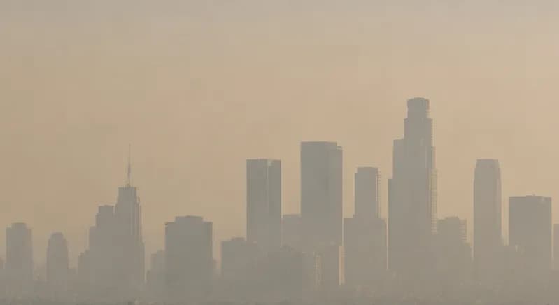
You can feel a bad-air day before you can see why. The sky looks flat, your eyes sting, and the fine particles doing the real damage never show up to the naked eye. That is the whole problem with air pollution, and it is exactly what an air pollution map solves. The map pulls readings from monitors and satellites, scores them, and turns your corner of the world a color you can read in a second. The trick is knowing how to read that color, and knowing what to do when it climbs. Both are easier than you might think, and both put you back in charge of the air your family breathes.
An air pollution map shows the current air quality for any location in color-coded zones, turning invisible pollutants like PM2.5 and ozone into a reading you can act on in seconds. At Filterbuy, we treat a high reading as a cue to protect the air inside your home, not just a number to note.
What it shows: real-time air quality scored on the Air Quality Index (AQI), from green for good to maroon for hazardous.
Where the data comes from: ground monitors and satellites, refreshed throughout the day.
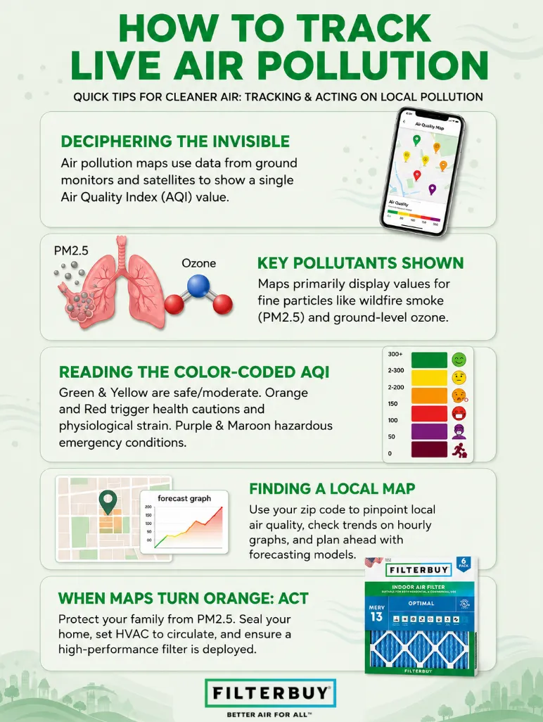
How to find yours: enter your zip code or share your location to see your current reading, the hourly trend, and the next-day forecast.
Why it matters to us: once your reading hits orange or higher, that outdoor pollution is reaching your indoor air too. Close the windows, switch your HVAC system to circulate, and let a higher-rated Filterbuy filter do the work.
An air pollution map turns invisible pollutants into a color-coded reading you can act on in seconds.
The six AQI colors run from green for good to maroon for hazardous, and orange is the level where indoor protection starts to matter.
You can find a map for your exact area by entering your zip code or sharing your location.
U.S. maps lean on ground monitors for precision, while world and global maps lean more on satellite data.
When outdoor pollution climbs, closing up your home and running a quality filter keeps indoor air cleaner.
An air pollution map shows current air quality across an area in color-coded zones. Behind those colors sits a network of ground monitors and satellite sensors, all measuring the pollutants drifting through the air around you. Most maps boil those measurements down to one number, the Air Quality Index, or AQI. That single score is what turns a messy pile of readings into something you can act on.
Two pollutants get the most attention on any map: fine particulate matter, written as PM2.5, and ground-level ozone. PM2.5 is the one we worry about most. These particles are small enough to slip deep into your lungs and even cross into your bloodstream, which is why they set off so many air quality warnings. Wildfire smoke, traffic, and nearby industry all push the numbers up. If you want the full breakdown of how the index is built, the Air Quality Index reference lays out the formula and the pollutants behind every score.
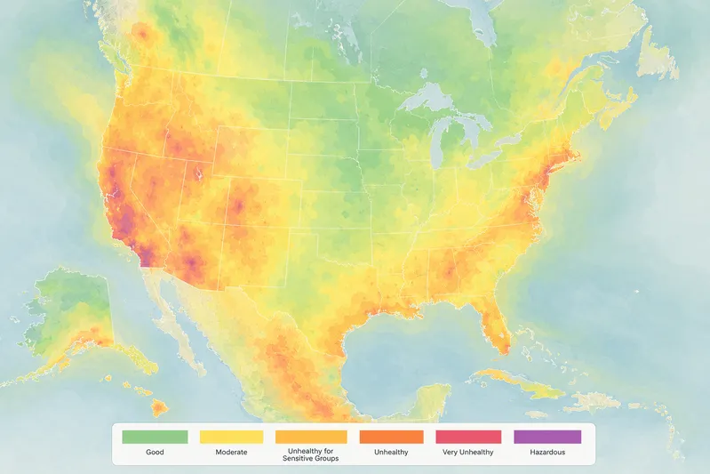
A live air pollution map updates all day long, so the color on your screen reflects right-now conditions, not yesterday's average. A real-time air pollution map does the same thing, refreshing as new monitor and satellite data come in. The colors follow the standard AQI scale. Learn these six categories, and you can read almost any map you open.
Good (0 to 50, green): Air quality is healthy and poses little or no risk.
Moderate (51 to 100, yellow): Air quality is acceptable, though unusually sensitive people may notice mild effects.
Unhealthy for Sensitive Groups (101 to 150, orange): Children, older adults, and people with heart or lung conditions should limit prolonged time outdoors.
Unhealthy (151 to 200, red): Everyone may begin to feel effects, and sensitive groups feel them more strongly.
Very Unhealthy (201 to 300, purple): This signals a health alert, and everyone should cut back on outdoor exertion.
Hazardous (301 and above, maroon): Emergency conditions where the entire population is likely to be affected.
Once your local reading hits the orange band, treat that as your signal to start thinking about the air inside your home.
Pulling up an air pollution map near you takes seconds. Here is the routine we recommend.
Open a trusted air quality map and type in your zip code, or let the site use your location.
Read the current AQI value and the color it shows for your area.
Check the hourly trend and the next-day forecast so you can plan.
Zoom in to see how things shift across town, since the air by a busy highway can read very differently from a spot a few miles away.
A pollution map by zip code gives you the most local read, while an interactive air pollution map lets you pan and zoom from a wide regional picture down to your own street. For a fuller walkthrough of the best tools and what each reading means, our guide on how to check outdoor air quality today takes you through it step by step.
Sometimes your own zip code is not the whole story. A US air pollution map earns its keep when you are tracking wildfire smoke as it drifts across several states, or planning a trip between regions. A world air pollution map and a global air pollution map are built for travelers and for anyone comparing one country's air to another's.
One difference is worth keeping in mind. The dense monitoring network across the United States feeds national maps a steady stream of ground-level readings, which keeps them sharp and current. Global maps lean harder on satellite estimates to cover the many places where ground monitors are sparse. Both are useful. Just read each one, knowing where its numbers come from.
Here is the part most people miss. Outdoor pollution does not stay politely outside. Those fine particles ride in through open windows, the gaps around your doors, and the fresh air your HVAC system pulls into the house. On a bad day, the air in your living room can drift toward the same unhealthy numbers you see on the map.
This is where you take the wheel. When your local reading climbs to orange or higher, close the windows and doors. Switch your HVAC system to circulate so it keeps cleaning the air instead of inviting more pollution inside. Then check that a quality filter is in place to do the heavy lifting. A higher-rated filter traps more of the fine particles the map is warning you about, right when your family needs that protection most.
“After manufacturing filters for over a decade and serving more than two million households, we have learned that an outdoor air quality reading is really a prompt to act indoors. When the map turns orange, the smartest move a homeowner can make is to close up the house and let a quality filter do its job. That is how you turn a number on a screen into real protection for your family.”
— Filterbuy Team
Air pollution is invisible, but these seven tools make it something you can see and act on. They are the resources we reach for to track the air outside and decide when it is time to protect the air inside your home.
This is the first map we check, and it is the one we point you to. Type in your zip code or share your location to see your current air quality, where it is trending, and what tomorrow holds, all from official monitors near you.
Source: AirNow interactive U.S. air quality map
We are a little obsessed with the tiny particles you cannot see, and this page explains them in plain language. Once you understand PM2.5 and where it comes from, every color on the map starts to mean something real for your family's health.
Source: EPA Particulate Matter (PM) Basics
A map gives you the number, and this guidance from the CDC tells you what to do with it, from easing off a hard workout to looking out for the people in your home who feel poor air the most.
Source: CDC guidance on air quality and your health
Wondering whether your city has a real air problem or just an off day? This annual report card grades and ranks communities across the country, so you can see exactly where your hometown stands.
Source: American Lung Association State of the Air
Sometimes it helps to zoom out. The World Health Organization shows how your local air compares to global health limits, which is the backdrop for any world or global air pollution map you come across.
Source: World Health Organization ambient air pollution fact sheet
Here is the satellite view we love. You can watch smoke and dust drift across the map in near real time and catch wildfire haze heading toward you before it reaches the ground.
Source: NASA Worldview satellite imagery
Wildfire smoke does not arrive without warning. NOAA's hourly forecast model shows where smoke is headed next, so you can close up the house and protect your indoor air before the haze rolls in.
Source: NOAA air quality and smoke forecasting
We think about air all day, so a handful of numbers shape how we read every pollution map. Here they are, plus what each one means for your home.
About 164,000 premature U.S. deaths in one year are tied to fine particle pollution (PM2.5).
This is not a distant problem. It is a hometown one.
We read a local map number as personal, not as a headline.
Source: County Health Rankings analysis of particulate matter and health
Each 10 microgram per cubic meter rise in long-term PM2.5 raises the risk of dying from heart disease by 23 percent and from stroke by 24 percent.
A filter is not only about dust and sneezes.
PM2.5 slips into your bloodstream and reaches your heart, not just your lungs.
Source: American Heart Association journal meta-analysis on PM2.5 and cardiovascular risk
A major Medicare study found death risk climbed with PM2.5 even below the national standard, with no level low enough to be safe.
This is the finding we wish sat on every thermostat.
The households that stay ahead act on a moderate reading. They do not wait for red.
Source: NIH research on air pollution and premature death
A map only earns its place if it changes what you do next. In our experience, the homeowners who get the most out of an air pollution map are the ones who treat a color change as a cue to act, not just a fact to note. Check your local reading the way you check the forecast. Pick the level where you will close up and switch to indoor mode, and hold that line. That one small habit protects the people under your roof better than any gadget you could buy.
Bookmark a live air pollution map set to your zip code, so a single glance tells you the day's conditions.
Pick your personal line. Plenty of families flip to indoor mode the moment the reading turns orange.
Look at your air filter and swap it if it is past due, so it is ready the next time the numbers spike.
An air pollution map shows current air quality across an area using color-coded zones tied to the Air Quality Index. It pulls data from ground monitors and satellites so you can see how clean or polluted the air is in real time.
Open a trusted air quality map and enter your zip code, or allow it to use your location. The map shows your current AQI value, the color category, and usually an hourly and next-day forecast.
Yes. A live air pollution map refreshes throughout the day as new monitor and satellite readings arrive, so the color you see reflects current conditions rather than an old average.
Enter your zip code to center the map on your area, then read the AQI number and color for that spot. Zoom in to compare nearby locations, since readings can change within a few miles.
The colors follow the AQI scale. Green is good, yellow is moderate, orange is unhealthy for sensitive groups, red is unhealthy, purple is very unhealthy, and maroon is hazardous.
A US air pollution map draws on a dense network of ground monitors for frequent, precise readings. A world or global air pollution map covers far more area and often relies more on satellite estimates where monitors are sparse.
A good rule is to take indoor action once your local reading reaches orange, the Unhealthy for Sensitive Groups range. Close your windows, run your HVAC system on circulate, and make sure a quality filter is in place.
Yes. Fine particles enter through windows, doors, and your HVAC system, so indoor air can reach unhealthy levels on high-pollution days. A higher-rated filter helps capture those particles before you breathe them.
The next time the map turns orange, make sure your home is ready. Find the right filter for your home and breathe easier knowing you are protecting your greatest assets: your family, your home, and your HVAC system.